



Brand Identity, Packaging Design
Creating a brand identity and packaging design for “Breathe” Skincare involved careful consideration of the brand’s values, target audience, and the essence of the product. Here’s an overview of what was done:
- Logo Design: The logo features a stylized wave motif, symbolizing the connection to the ocean and the gentle, rejuvenating qualities of the sea. The choice of colors, such as shades of blue and green, reinforces the brand’s natural and aquatic theme.
- Typography: Clean and elegant typography was selected to convey a sense of sophistication and trustworthiness. It ensures that the brand name and product information are easily readable.
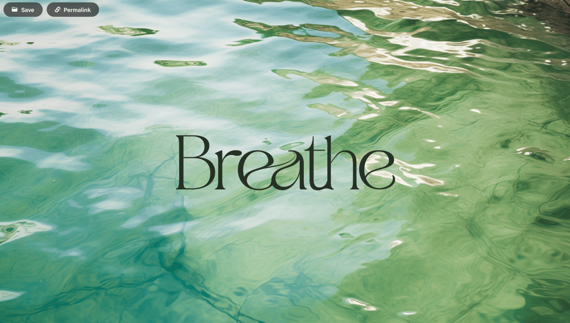
- Brand Colors: The color palette includes oceanic shades like aqua blue and seafoam green, creating a visual link to the sea. These colors also convey a feeling of freshness and vitality.
- Brand Imagery: High-quality, nature-inspired imagery, including images of ocean waves, pristine beaches, and underwater scenes, is used to visually reinforce the brand’s connection to the sea.
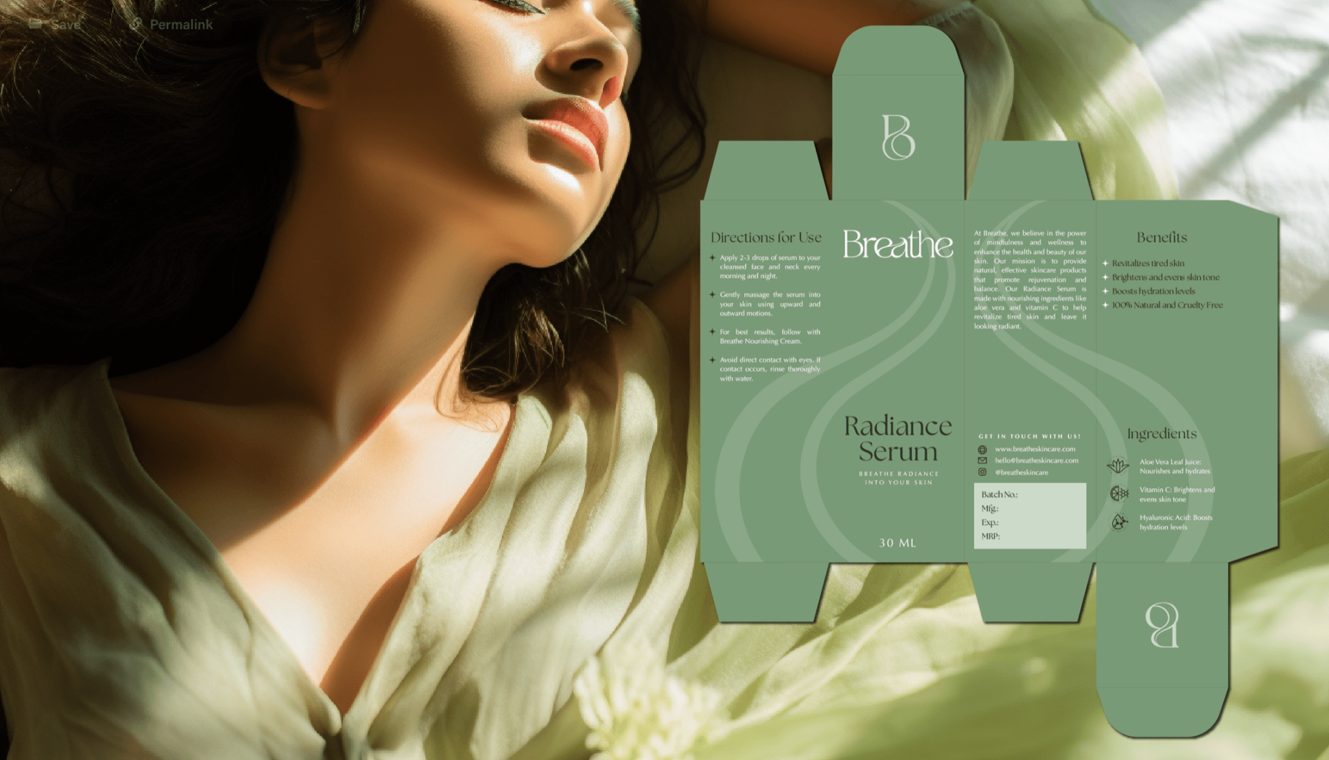
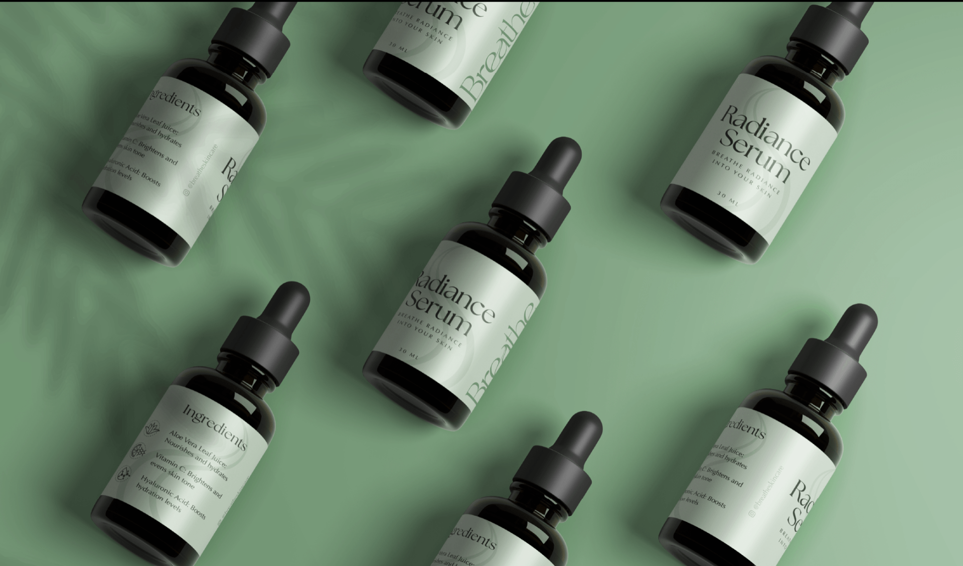
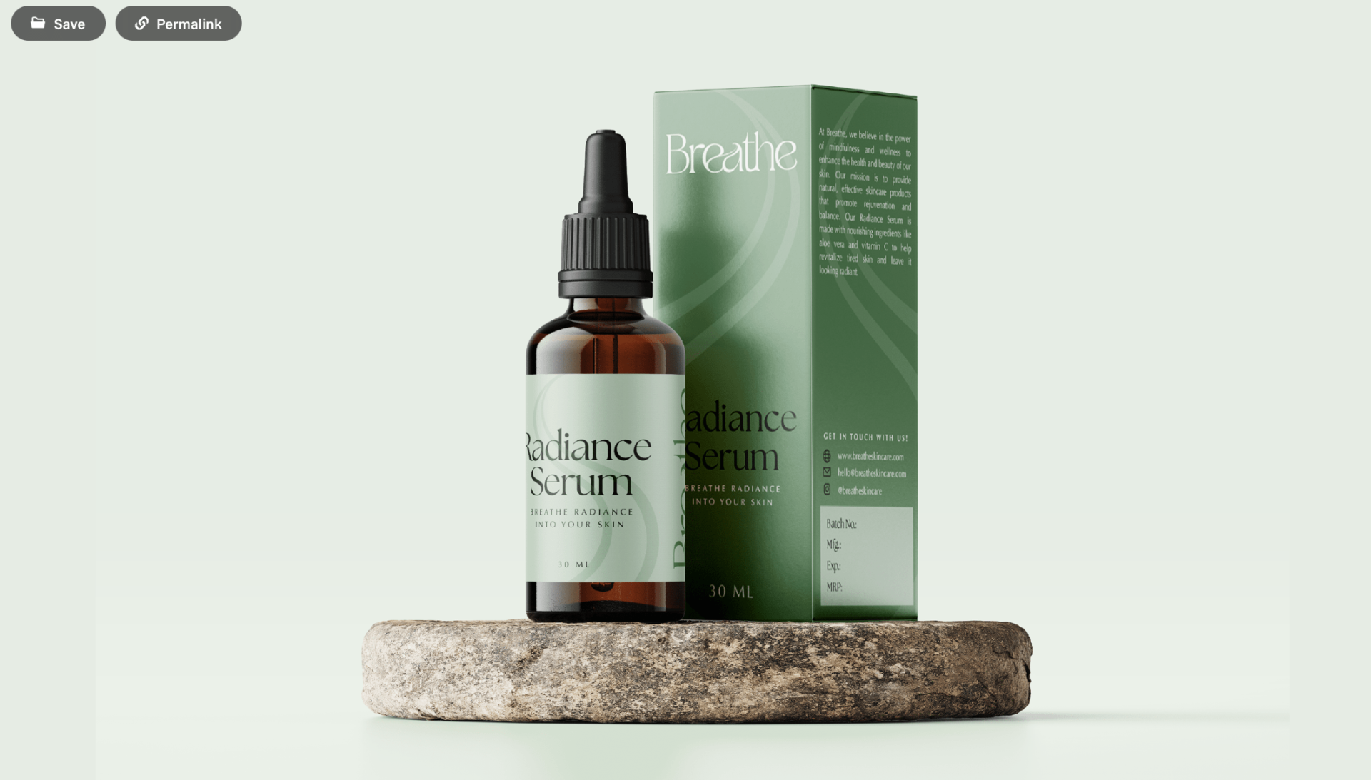
- Product Packaging: Labels feature the “Breathe” logo prominently along with clear and concise product names, descriptions, and usage instructions. The use of waterproof materials ensures durability, especially for products used in bathrooms.
Task
Creating a brand identity and packaging design for "Breathe" Skincare involved careful consideration of the brand's values, target audience, and the essence of the product.
